11,80 €*
Info sui prodotti "Gamblin Artist Grade Oil Colors"
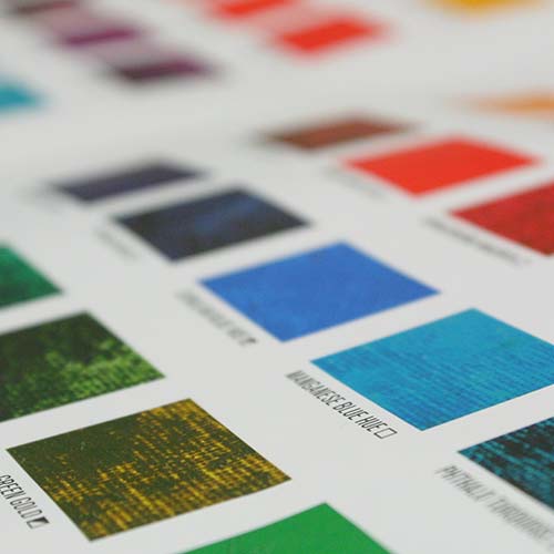
The Gamblin Color Palette
Robert Gamblin organized our palette into Mineral and Modern color groupings to help artists easily choose a palette of colors
that best matches their artistic intent. Our colors are also grouped by eras of pigment history: Classical, Impressionist, and 20th
Century. Throughout the history of art, paintings have always been a reflection of the materials that were available to artists.
Mineral Colors
The Mineral side of the color chart includes those colors made from inorganic pigments, that is, metal ores dug from the earth.
For many of these pigments, their color is developed in ovens at very high heat. At the bottom of the Mineral side of the chart
is the group of earth colors that made up the heart of painters’ palettes during the Classical Era. This group of pigments, which
has its origins in cave painting and antiquity, was central to the oil painter’s palette from the Renaissance through the Classical
Era. From this limited range of earth colors, painters depicted form by drawing large contrasts between the darkest darks and the
lightest lights, creating the chiaroscuro (literally, “light/dark”) effect so characteristic of classical paintings.
During the Industrial Revolution, a whole new array of inorganic pigments was developed from compounds of minerals, such as
cobalt, cadmium and manganese. Their intense mass tones complemented earth colors on painters’ palettes and replaced paints
made from expensive semi-precious stones, fugitive colors, or highly toxic compounds. This full spectrum of pigments, packaged
for the first time as oil colors in tubes, expressed the Impressionists’ interest in pure color.
Mineral Colors grey down when mixed with white, which is perfect for capturing the colors of the natural world. Mineral-based
pigments have larger pigment sizes and lower tinting strengths than modern colors. They are leaner and naturally more matte.
Mineral colors are mostly opaque. Ultramarine Blue and Viridian, which are transparent, are exceptions. Mineral colors have a
Lightfastness rating of Excellent (I).
Modern Colors
Modern organic pigments are carbon-based. Most modern colors, including Quinacridone, Phthalo, and Perylene, are
transparent. Hansa and Napthol are semi-transparent. Because of their small particle sizes and higher oil absorption (fatter),
modern pigments make colors of very high tinting strengths that are naturally more glossy.
When mixed with white, modern colors make incredibly intense tints. They stay high key in mixtures unless a complement is
added. Rather than shifting from light to dark, a family of modern colors shifts from warm (Phthalo Emerald) to cool (Phthalo
Green). Modern colors have a Lightfastness rating of Excellent (I), with the exception of Hansa Yellow Light and Napthol
pigments, which are rated as Very Good (II). Each tube of artist’s grade oil color is marked with a Lightfastness rating.
Mineral and Modern colors are completely compatible with each other. Painters can use the characteristics of each color group
described above to create their own personalized color palette.
Radiants
Gamblin Radiant Colors offer painters eight intense tints – mixtures of pure color and white – at Value 7 on the Munsell®
System. Using these Radiant tints, painters can build high key underpaintings and then glaze to achieve optical effects of light
and shade.
White, Grey & Black
The most important color choice we make is the white we bring to our work. There are nine different Gamblin Whites to give
artists a range of working properties, temperatures, drying rates and opacity. Please refer to our Studio Notes Newsletter, Getting
the White Right, on our website for more information on selecting the right white for your work.
Gamblin Portland Greys (Light, Medium, and Deep) can mute the high key tints of the modern colors to make more naturallooking
mixtures. Named for the city where they are made and its characteristic grey skies, the Portland Greys are formulated
for painters who work with value. Our range of the neutral Portland Greys is expanded with Portland Warm Grey and Portland
Cool Grey. A triad of muted primary colors is created when Titanium Buff is added to these. This gives painters the ability to
complete a range of “colored greys.”
Gamblin Chromatic Black gives painters a neutral, tinting black with energy that doesn’t muddy and flatten the colors the way
traditional blacks do. Because Chromatic Black is made from two colors that are perfect complements, Quinacridone Red and
Phthalo Emerald, it gives painters a dead-center black with life to it and a clean transparency.
Login
21 marzo 2023 21:44
Lieblingsfarben
Sehr hochpigmentiert und dick in der Konsistenz, meine absoluten Lieblingsfarben!
20 luglio 2019 05:15
The Best Oil Paints For Beginner And Professional Level Artists
These are excellent oil paints. Highly pigmented and the color is so perfect throughout. The texture is wonderful and the paint stays smooth and does not separate from the oil.


